How to write a cursive J
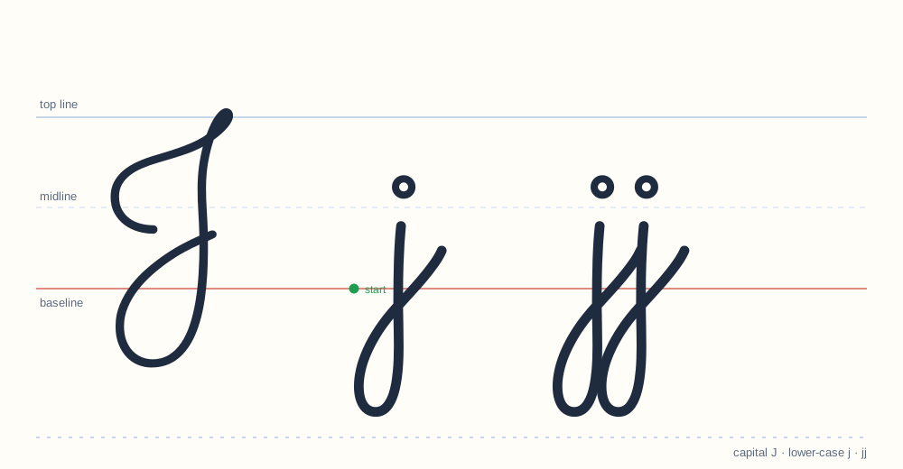
The j mirrors i but descends below the baseline and loops left. Dot placement matters: the dot belongs above the gap, not above the descender.
Drawing the capital
Start at the baseline, upstroke to the midline, straight down below the baseline with a loop to the left, then dot.
Drawing the lower case
Like the capital: a downstroke that descends below the baseline and loops left, with a dot above.
The join after J
j joins from the top of its loop, not from the descender — the same rule as g.
Where it goes wrong
Connecting from the bottom of the loop, which forces the pen to jump.
Setting up practice for J
Three things decide whether practice works: the surface, the tools and the length. A flat table, a pencil with a visible point and lined paper with a midline — that is the whole setup. Sessions of ten minutes beat sessions of thirty; a child who practices tired learns a tired version of the letter, and unlearning it costs more than the extra minutes gained. For the J specifically, print two copies of the worksheet: one for the first attempt, one for the comparison at the end of the week.
The adult version of J
Adult cursive drifts away from the school model: the descender gets longer and more angular. That is normal — handwriting is a tool, not a museum piece. But when an adult wants to improve legibility, the fix is always the same: go back to the school letterform for a week, then let speed return on its own. The letter below the drift is still the letter; J does not change its identity at speed.
Where J sits in the three zones
Cursive measures every letter against three horizontal lines: the top line, the midline and the baseline. J occupies the middle and lower zones, dipping below the baseline. Keeping that height consistent is what makes a page of handwriting look even — a letter that drifts up or down is the first thing a teacher notices, before any question of style.
Words to practice
just jump job join enjoy
These words appear on the printable J worksheet (PDF, 1 page), which also carries trace models for both cases and blank practice lines.
What a correct J looks like
- Height: dips below the baseline, like g and y.
- Start and exit: begins at the baseline, ends ready to join the next letter.
- Proportion: the loops and curves stay even across a line — uneven Js are the first sign of rushed practice.
Download the J worksheet (PDF) All 26 letters
New to cursive? Start with the beginner guide.