How to write a cursive T
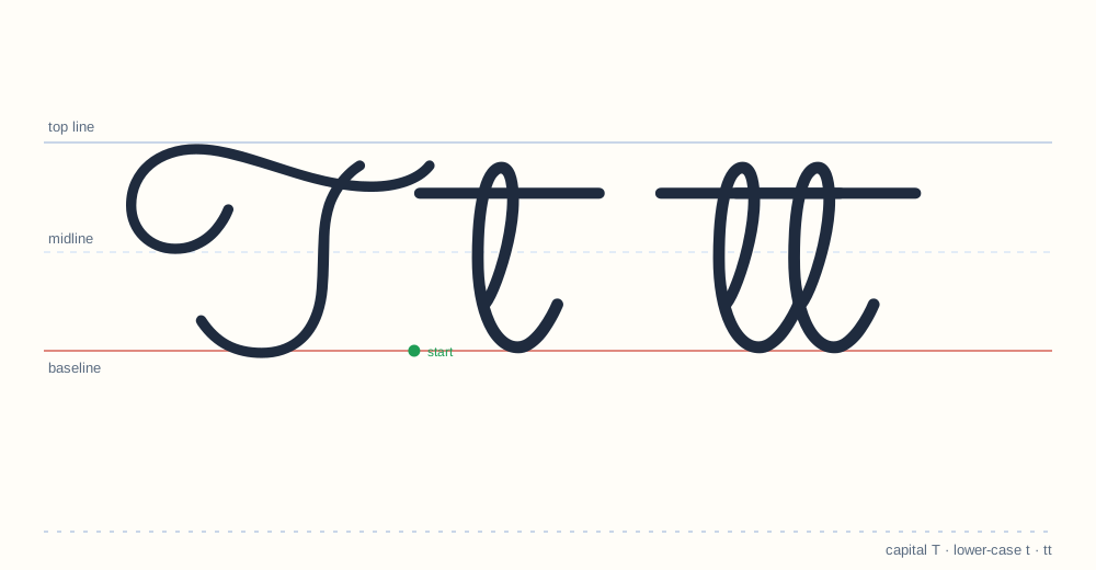
The t is a tall stroke plus a crossbar added last. Adding the crossbar during the stroke breaks the connection to the next letter — always cross after the word is written.
Drawing the capital
Downstroke from the midline straight to the baseline, then a crossbar added last, with a small exit hook.
Drawing the lower case
Similar to the capital but shorter, with the crossbar added after the letter, not during.
The join after T
t joins from its exit hook. The crossbar is best added after the word is written.
Where it goes wrong
Crossbar before the stroke, or no exit hook so it cannot join.
Setting up practice for T
Three things decide whether practice works: the surface, the tools and the length. A flat table, a pencil with a visible point and lined paper with a midline — that is the whole setup. Sessions of ten minutes beat sessions of thirty; a child who practices tired learns a tired version of the letter, and unlearning it costs more than the extra minutes gained. For the T specifically, print two copies of the worksheet: one for the first attempt, one for the comparison at the end of the week.
The adult version of T
Adult cursive drifts away from the school model: the curve gets faster and the letter flattens. That is normal — handwriting is a tool, not a museum piece. But when an adult wants to improve legibility, the fix is always the same: go back to the school letterform for a week, then let speed return on its own. The letter below the drift is still the letter; T does not change its identity at speed.
Where T sits in the three zones
Cursive measures every letter against three horizontal lines: the top line, the midline and the baseline. T occupies the top zone as well as the middle. Keeping that height consistent is what makes a page of handwriting look even — a letter that drifts up or down is the first thing a teacher notices, before any question of style.
Words to practice
to it at the time
These words appear on the printable T worksheet (PDF, 1 page), which also carries trace models for both cases and blank practice lines.
What a correct T looks like
- Height: reaches the top line, like l and k.
- Start and exit: begins with a tall loop, ends ready to join the next letter.
- Proportion: the loops and curves stay even across a line — uneven Ts are the first sign of rushed practice.
Download the T worksheet (PDF) All 26 letters
New to cursive? Start with the beginner guide.